Navigation
The portal has two main navigation areas that work together to help you move around and use tools efficiently. Understanding the difference between them makes it much easier to find what you need.
Layout at a Glance
| Area | Position | Purpose |
|---|---|---|
| Navbar | Top bar — spans the full width | Quick-access tools, search, notifications, profile |
| Sidebar | Left panel — fixed to the left edge | Navigation links to all pages in the portal |
Navbar

The navbar stays pinned to the top of every page as you scroll, so your tools are always within reach. This is where all your action tools live — from searching clients ,add client to checking notifications. See the Navbar page for a detailed breakdown of every item in this section.
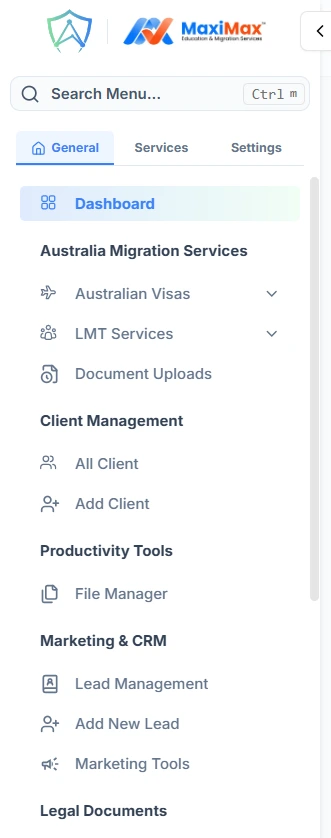
Sidebar (Left Panel)
The sidebar is the main navigation menu of the portal. All the pages and sections of the portal are organised here as a list of links grouped by category.See the Sidebar page for a detailed breakdown of every item in this section.
How it behaves
- On large screens (desktop), the sidebar is always visible on the left side of every page.
- On small screens (tablet/mobile), the sidebar is hidden by default and slides in when you tap the hamburger button in the navbar.
- The sidebar can be collapsed to a narrow icon-only strip to give you more screen space, and expanded back to show full labels. A small arrow toggle button sits on its right edge to control this.
How They Work Together
The navbar and sidebar complement each other:
- Use the sidebar when you want to go to a different page — it is your main map of the portal.
- Use the navbar when you want to take an action or check something without leaving the page you are on — notifications, reminders, search, mail, and so on.
The hamburger button in the navbar is the bridge between the two: on mobile it is the only way to reveal the sidebar.